I'll wade into this question as well, if I may. First of all, you're right, b00m, in that I think (and hope) all the work you (and your fellow RA's) do for
CSR is greeted with a certain amount of polite restraint. When people are working long and hard (for no money, since I can't afford to pay anything) to share their artistic efforts with their fellow spankos here, a certain amount of simple gratitude is in order. Thus, I would hope readers would refrain from nit-picking about minor matters.
However, Dan's criticism is more substantive and deserves careful consideration. Yes, the
speech balloons in
Katie take up a lot of room (I'll explain the reason for the emphasis shortly), but the basic layout in this last adventure is good, and I personally am inclined to cut you some slack for the following reasons:
- While cartoonists are often expected to both draw and write their cartoons, there's no reason to expect them to be masters of two very different crafts. Think of song-and-dance men like Fred Astaire and Gene Kelly: both sang adequately, but they were primarily dancers, not singers. Gower Champion, the dancer/choreographer, was barely adequate vocally. Yes, guys like Will Eisner and Milton Caniff were artist/writers (I prefer the term to "writer/artist" because of where the emphasis is - in fact I'm sure this question came up on Phil's Gallery in the past), they were writers on the level of say Mickey Spillane or Earle Stanley Gardner, not William Faulkner and F. Scott Fitzgerald!
 Thus, I think the artist/writer should be granted some allowance here. Putting the shoe on the other foot, if I had to draw my own scripts as well as write them, people would probably start a collection to "help that poor retarded kid learn to draw like other eight-year-olds"!
- Overwriting is difficult to avoid in the comics medium. When I wrote my first comic script, I was an experienced writer who carefully considered the problems of the form and realized the dangers of overwriting - yet I did it anyway! (Not too badly). The truth is that probably the greatest limitation of the comics form is that long speeches (even more so than long descriptive passages) cannot be sustained (a comparatively long description in a caption on a big panel works better than a long speech in a balloon). That's not an excuse for not paying attention to what we're doing, but again, it's something even a really good writer can be expected to butt up against now and then.
- I mentioned that I overwrote my comic a little. My letterer helped me out by using a slightly smaller font, thus compressing more words into the same space. And that brings me back to the speech balloons, which I suppose I could have gotten into without all this introduction (see how easy it is to overwrite
 ):
):
Your fonts are rather on the large size, grateful as my aging eyes are for them
. Look at some of the great letterers of the past, guys like
John Costanza or
Sammy Rosen, and you'll see that their fonts are generally much smaller than yours. Rosen occasionally used fonts about as big as yours, but only with exclamations of extremely powerful characters like Odin, Galactus, etc. Of course, these men lettered by hand since digital lettering was not possible in their day, but the principle is the same. Today's letterers also tend to use much smaller fonts than yours. So while watching how many sentences we're trying to force into a typically-sized panel is always a good idea, I think you could solve many of your difficulties just by cutting down the font sizes a little.
Just a "small" suggestion - in the end, you have to letter your comics the way you think is right. I and your other fans are not going anywhere, even if you choose to give Bullmoose a font big enough for the Great Galactus himself
!
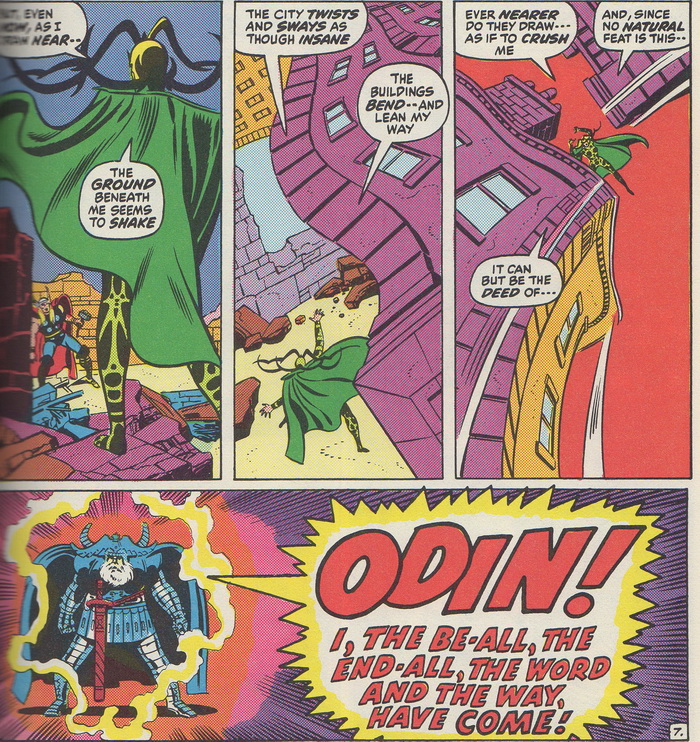
A character who demands a large lettering font:
Odin, the King of the Norse Gods! From
The Mighty Thor #190 (July, 1971). Script by Stan Lee, art by John Buscema and Joe Sinnott,
lettering by Sam Rosen! Copyright Marvel Characters Inc.
